On this page
You can design a website for free by deciding what one visitor should do, mapping a simple page around that goal, and testing the result before publishing. The work usually stalls before it starts: you compare tools and prices while the page you need stays unwritten. This guide shows how to design a website for free in six practical steps, from defining one goal to a tested, mobile-ready launch.
Define the site’s one job and choose a free route
Start with a single sentence: who the site is for and what one action they should take. Booking a call, ordering a product, and subscribing to a newsletter are all valid jobs.
That sentence becomes your filter. A layout, image, or paragraph that does not move the visitor toward the action gets cut, no matter how attractive it looks on its own.
You need very little before you start: the one-line brief, any real photos or text you already have, and a rough sense of who will visit. Everything else is decided inside the free tool.
Choosing to design a website for free with easy steps only works when each step serves that one job. Free AI website builders for different users all promise the same starting point: templates, a visual editor, and publishing at no cost.
Check what a free route actually includes before committing. Free options can suit simple projects well, but they may not cover everything a business site needs, so confirm the current terms before any business launch.
Map the page before you touch a template
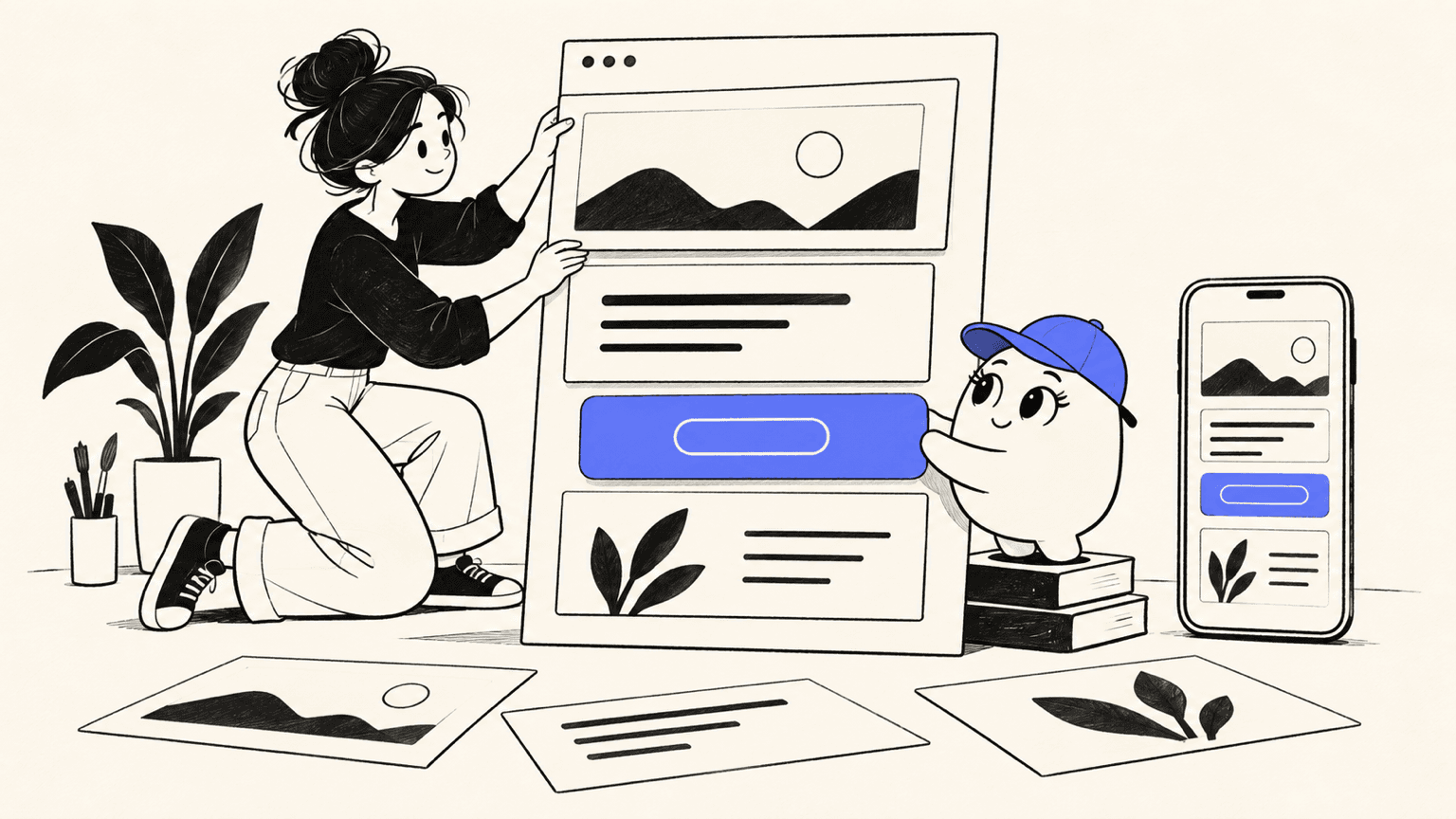
A free template looks faster than planning, but unplanned pages drift. Sketch the page as four blocks before opening any editor. Each block answers one visitor question, in the order a first-time visitor asks them.
| Page block | Visitor question it answers | What to prepare first |
|---|---|---|
| Promise | Why should I care? | One headline stating the offer and audience |
| Proof | Can I trust this? | Two or three facts, results, or testimonials |
| Action | What do I do next? | One button with a plain-language label |
| Supporting detail | What else should I know? | Short answers on pricing, timing, or process |
With this map, the design work in the next steps is execution, not guesswork. You already know what each part of the page must say and where it belongs. It also keeps you from inheriting a template’s problems: a beautiful demo layout rarely matches the content you actually have.
Design the first screen for clarity
The first screen carries the whole promise block. Visitors decide in seconds whether the page is for them, so this screen earns more design attention than everything below it combined. Everything here happens inside the free editor’s style controls; no code is required.
Step 1: Establish a clear visual hierarchy
Make the headline the largest element on the screen, followed by one supporting sentence. If everything looks equally important, visitors read nothing; if one line clearly leads, they keep going.
Step 2: Set typography and spacing to match
Use one font family, two weights at most, and generous white space around the headline. Consistent spacing makes a free template look deliberate instead of default.
Step 3: Give the visitor one obvious next action
Place a single button below the promise, labeled with the action itself, like Book a call or See pricing. Remove competing links from the first screen so the choice stays obvious.
Check the screen by squinting at it. If the headline and the button still stand out through the blur, the hierarchy works.
Build the rest of the page around the visitor’s questions
Below the first screen, the page answers questions in order: proof, details, then action again. Each of the next three steps adds one layer without disturbing the clarity you built above.
Step 4: Add proof and the details visitors ask for
Place testimonials, results, or credentials right after the promise. Follow with the practical details people check before acting: what is included, how long it takes, and what it costs.
Step 5: Keep navigation and forms short
Limit the menu to the few pages a visitor genuinely needs, and ask only for the information you will actually use. Every extra field or menu item costs you completions.
Step 6: Use images only where they clarify
Add an image when it shows the product, the result, or the person behind the offer better than words can. Skip decorative stock photos that add weight without meaning.
Read the page top to bottom as a stranger would. Any block that does not answer a real visitor question goes back to the cutting board.
Preview, test, and publish without surprising visitors
Design is not finished when the page looks right on your laptop. It is finished when a first-time visitor on a phone can understand the offer and complete the action. This pass takes under an hour for a one-page site and prevents almost every embarrassing launch mistake. Work through it in order.
- Mobile review: Open the page on a phone or in the editor’s mobile preview. Text should be readable without zooming, and the main button should fit the screen without sideways scrolling.
- Links and forms: Click every link and submit every form with test data. A broken form on a free plan still costs real visitors, and it is cheapest to catch before launch.
- Accessibility basics: Check color contrast, add descriptive alt text to meaningful images, and make sure the page reads sensibly as a single column.
- Free-plan fallback: If the free route cannot support the site’s job, publish the simple version now and plan the upgrade instead of forcing the fit.
Once these checks pass, publish. A live page you can improve beats a perfect draft nobody sees.
How Atoms helps you design an editable first version
Atoms is an AI product-building platform that turns plain-language instructions into editable websites and web applications. You describe the audience, purpose, pages, and visual direction, review what it generates, and refine the layout, copy, and media before anything goes live. Multiple specialized agents coordinate across the product lifecycle, which compresses the six steps above into a shorter loop you still control. Production settings and launch requirements still deserve a human review before publishing.
- Build from a brief, not a blank canvas: Atoms turns a natural-language brief into a working website with a coherent structure and visual experience. You start from a complete first version of the page you mapped above, then iterate through conversation instead of dragging blocks from scratch.
- Edit through focused requests: Each revision keeps the product editable and inspectable. You can ask for a different layout, a replaced image, or better mobile behavior, and review every change in a live preview before it ships.
- Generate and place media in one workflow: Atoms can create images and videos and insert them into the page where visual storytelling matters, so a hero section or product visual stays connected to the design instead of arriving as separate files.
- Add backend capabilities when the site needs them: For products that need more than a frontend, Atoms can provide application infrastructure such as persistent data, authentication, and deployment workflows, so the same project can evolve after the first version. Production settings, integrations, and performance still need your review before launch.
Relevant Atoms cases
You can browse what others have built to see how these capabilities look in finished sites. Three examples follow.
Modern & Decorative Vases Online Store A modern decor e-commerce site selling decorative vases and home pieces, showing a polished visual layout built around one clear shopping goal.
British Aran Knitwear ALBION HOUSE, a high-end knitwear store for made-to-measure luxury knitwear, showing how a refined editorial layout keeps the offer and the next action unmistakable.
California Surf & Swimwear TIDEBREAK, a surf and swimwear store built around ocean lifestyle fashion, showing a strong first-screen hierarchy that leads visitors to one clear action.
Conclusion
Designing a website for free works when the goal leads and the tool follows. Define one action, map four blocks, design the first screen for clarity, then test on a phone before publishing. Free plans carry limits, so confirm the terms before a business launch. When you want a faster first version, Atoms turns a page brief into an editable site you can preview and refine. Start your first build on Atoms and publish this week.
A little more clarity
Frequently asked questions
01Q1: Can you really design a website for free?
Yes. Free website builders and AI tools cover the design work itself: templates, editing, and basic publishing at no cost. The trade-offs usually appear at launch rather than during design, so read the free plan’s current terms before you build, especially for a business site.
02Q2: What pages does a basic website need?
Most small sites need three to five pages: a homepage carrying the promise and the action, an about page, and a contact page, plus a work, product, or pricing page if you sell something. Start with the homepage only, and add pages when real visitor questions demand them.
03Q3: How can you make a free website look professional?
Restraint does most of the work. Use one font family, consistent spacing, a single clear action per screen, and images that show real products or results. Write headlines that name the offer and audience plainly. A simple page with a clear hierarchy always beats a decorated one without it.
04Q4: When is a free website plan not enough?
A free plan stops being enough when the site becomes a real business asset rather than a simple project. Personal projects and idea validation rarely outgrow a free route; an established business site usually needs more, so check the current plan terms and budget for an upgrade then.
Share this article
 Posts
Posts 